The five tabs
| Tab | What you see |
|---|---|
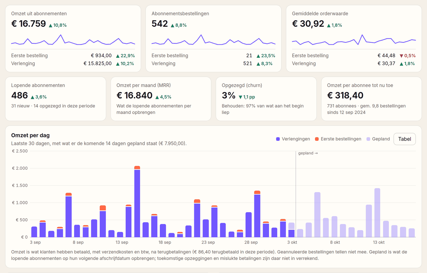
| Revenue | Revenue of subscription orders (first orders and renewals apart), number of orders, average order value, MRR, churn, revenue per day, week or month with what is scheduled, and revenue per part of Loyalo |
| Subscriptions | New, cancelled, net growth and paused, the MRR over time, how long stopped subscriptions ran, frequencies and payment methods, expected revenue, cohorts and customer value, payments and cancellation reasons |
| Products | Per product the revenue, the share, the units and orders, and how many running subscriptions contain it |
| Loyalty | Customers with points, active savers, repeat purchases, points earned and redeemed, where points come from, the most chosen rewards, tiers and outstanding points |
| Messages | E-mails sent per kind, what was not delivered and the events to Klaviyo |
Revenue
- A subscription order is the first order of a subscription or a renewal. One-off orders without a subscription do not count here.
- Revenue is what the customer paid, with shipping and VAT, after refunds. Cancelled and unpaid orders do not count.
- Every figure is split into first orders and renewals. That shows whether growth comes from new customers or from customers who stay.
- The chart shows revenue per day for a period of up to a month, per week up to about four months and per month above that. When the period runs up to now, to the right of the line 'planned' is what the running subscriptions bring in over the next 14 days, 6 weeks or 3 months. For a period that is over (last month, your own dates) there is no 'planned', and states such as paused, payment problems and outstanding points are those of now.
- Move the mouse or the arrow keys over the chart for the amounts of one day. The button 'Table' shows the same figures as a table.
- 'Revenue per feature' lists subscriptions, orders with a reward code, first orders of referred friends and standing orders (B2B). An order can belong to more than one part.
- 'Retained and won back' counts the customers who stayed after the offer when cancelling, cancelled subscriptions that came back and deliveries that were paid after a failed attempt.
The first time you open Analytics, Loyalo reads the subscription orders of the past two years from Shopify. That includes the orders from before Loyalo, when they carry the tag 'subscription' in Shopify. The figures fill up meanwhile; a notice at the top says when that is still running.
Subscriptions
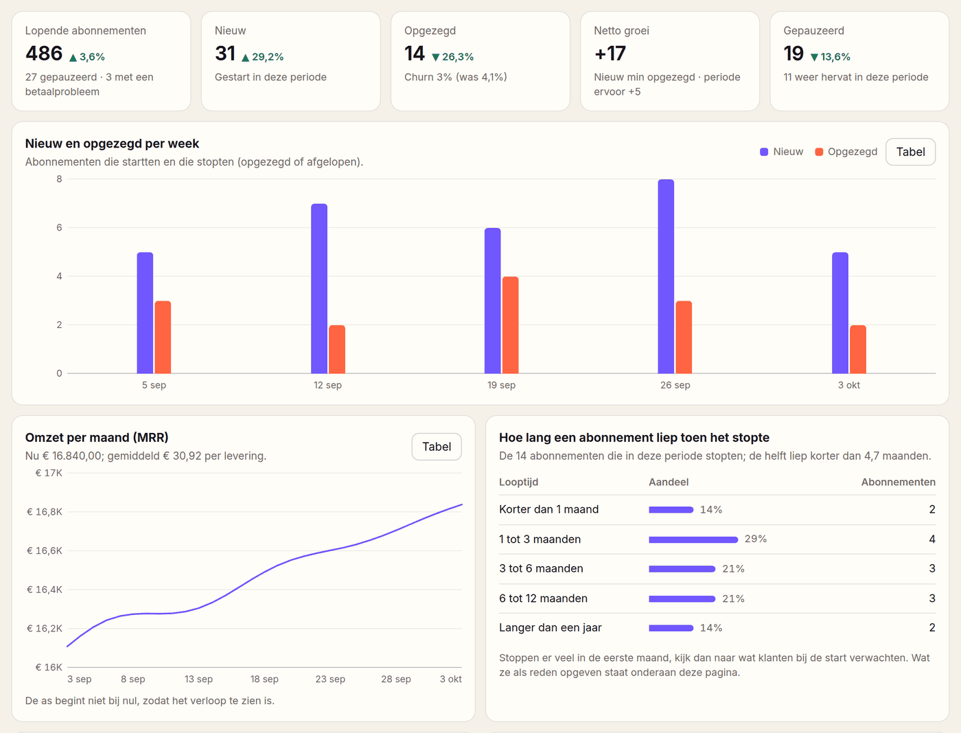
- At the top: running subscriptions, new, cancelled (with the churn), the net growth and how many were paused and resumed.
- MRR is the recurring revenue of your running subscriptions, converted to a month. The line shows it over the period.
- Churn is the part of the subscriptions that were running at the start of the period and stopped in the period.
- 'How long a subscription had run when it stopped' spreads the stopped subscriptions over shorter than a month, 1 to 3, 3 to 6, 6 to 12 months and longer than a year.
- 'Per frequency' and 'Payment method' show how the running subscriptions are divided.
Expected revenue
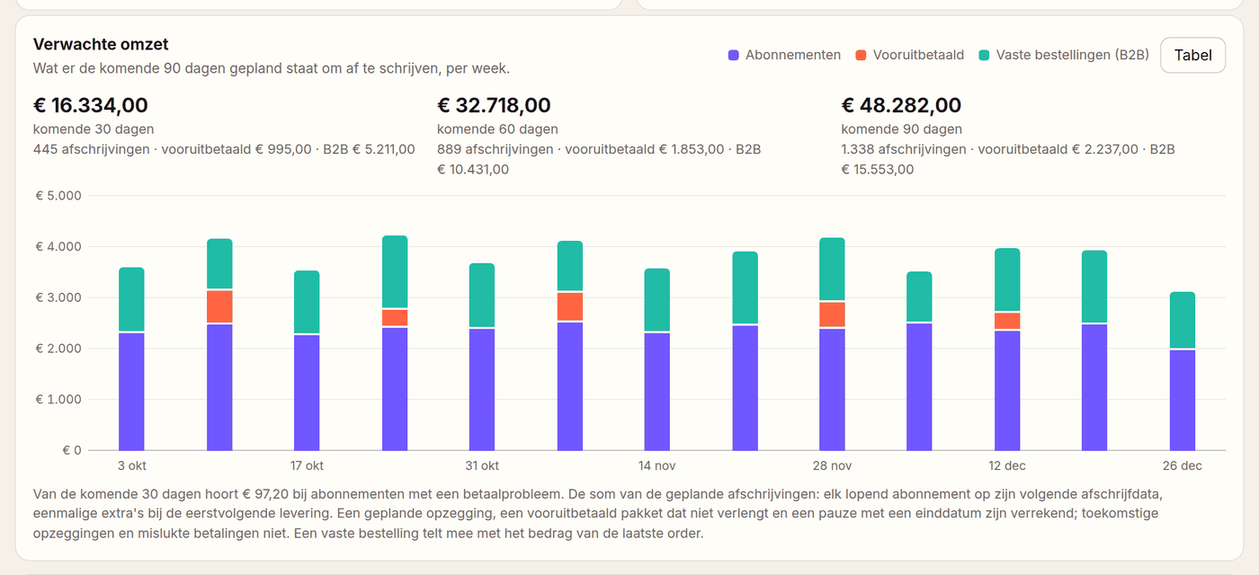
The sum of the scheduled charges in the next 30, 60 and 90 days, per week, with prepaid and standing orders (B2B) shown separately. A planned cancellation, a prepaid bundle that does not renew and a pause with an end date are counted. Future cancellations and failed payments are not.
Cohorts, payments and cancellation reasons
- Cohorts: per start month which part of the subscriptions is still running after 1, 2, 3, 6 and 9 months, with the expected customer value (LTV) above it. You look back 6, 12 or 24 months.
- Payments: successful charges, failed attempts, the share that was paid after all and how many subscriptions have a payment problem now. Split per payment method (iDEAL and SEPA through Mollie, or card through Shopify), with the reasons why payments failed.
- Cancelling and retention: how often the offer when cancelling was accepted, how many subscriptions were won back and which reasons customers gave.
Products
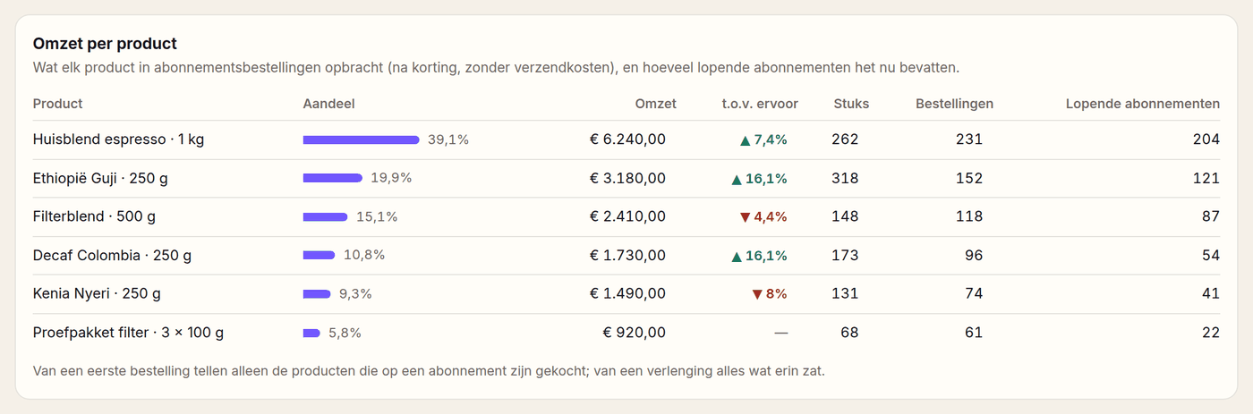
Per product you see the revenue in subscription orders (after discount, without shipping), the share of the total, the difference with the period before, the units and orders, and how many running subscriptions contain the product now. Of a first order only the products bought on a subscription count; of a renewal everything in it.
Loyalty and messages
- Loyalty: customers with points and how many are new, active savers, repeat purchases, points earned and redeemed per week, revenue through rewards and revenue from customers who save.
- 'Where the points come from' spreads the earned points over orders, campaigns, a new account, reviews, referred friends, birthdays and the newsletter.
- 'Most chosen rewards' shows per reward how often it was chosen, how often the code was used and what those orders brought in.
- Below that: customers per tier, the outstanding points with their value, what expires soon and what referred friends brought in.
- Messages: e-mails sent per kind with the difference with the period before, what was not delivered, and the events that went to Klaviyo.
With 'Export (CSV)' on the Analytics page you download the subscription orders of the chosen period, one line per order: date, order number, first order or renewal, amount paid, products, refunded and the subscription. You export the subscription list and your customers on their own pages. Exporting needs the role owner or admin.
Upcoming deliveries
Under Subscriptions > Deliveries you see per day which deliveries are coming up and how many items you need per product. Useful for purchasing and packing.
Activity and status
| Page | What you use it for |
|---|---|
| Activity | At the top, what is happening in your shop right now: new subscriptions, changes by customers, payments and redeemed rewards, refreshed every 15 seconds. Below it, who changed what |
| Messages | All e-mails, Klaviyo events and webhooks in one list, with filters and a button to send a failed message again |
| Status | Jobs that failed (an e-mail, a collection, a Klaviyo event) with the error and a retry button |
| Widget | With an A/B test: views and add-to-carts per version |
The first three pages are in the menu under Log.
What does the arrow compare with?
With the period right before it. Choose 30 days and that is the 30 days before; choose a whole month, a quarter or a year and it is the month, the quarter or the year before. The line under the bar says which period it is. Green is a change in the right direction, red in the wrong one: for cancellations fewer is green. A dash means the period before has no data.
Why does the revenue differ from Shopify?
Analytics only counts subscription orders: the first order of a subscription and every renewal, with shipping and VAT and after refunds. One-off orders are not in it. Shopify counts all orders and has several revenue figures, such as gross, net and total sales.
How do I see why customers cancel?
At the bottom of the Subscriptions tab, 'Cancellation and retention' lists the reasons customers gave and how often the offer (discount, skip or pause) prevented a cancellation.
What is a cohort?
All subscriptions that started in the same month. The table shows per start month which part is still running after one, three or six months.
Where do I see how the widget performs?
On the Widget page. With an A/B test on, you see per version how often the widget was shown and how often a subscription or one-time purchase went into the cart.
Team and shops
Give colleagues a role (owner, admin, staff or viewer), work with several shops and follow every change in the activity log.
Prepaid and gifting
Sell several deliveries in one payment and let customers give a subscription as a gift with a recipient, a message and a start date.
Widget on the product page
Put the subscription choice on your product page and set the look, texts and labels. Try a new design as a draft or with an A/B test first.